💡 This post was written when I was much younger, so the code examples may not reflect my current coding style or best practices.
Introduction
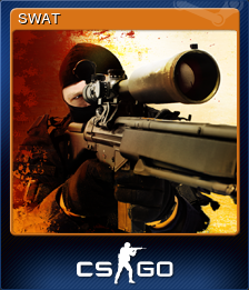
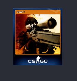
Recently, I found myself browsing through the activity feed below the games in my Steam library, checking out my friends' achievements. As I was doing so, I noticed that I had received a trading card for the game Counter-Strike: Global Offensive. Out of curiosity, I hovered over it to see if any additional information would be displayed. Instead, I was pleasantly surprised by a really cool 3D trading card effect.
I thought it would be a fun little challenge to see if I could recreate this effect without looking at the source code. In this post, I will walk you through the process of recreating the Steam trading card hover effect using HTML, CSS, and JavaScript.
Rotating the Card
I'll be completely honest — I may have spent over an hour trying to figure
out how to rotate an image to achieve the same effect seen with trading
cards on Steam. I quickly realised that the
transform: rotate3d() CSS property would be essential for this
task. However, despite my efforts, I could not get the edges to align in the
same way as Steam's trading cards.
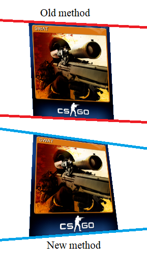
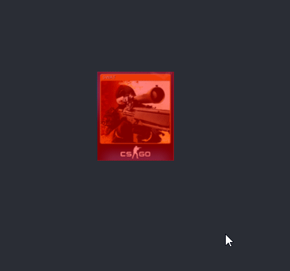
Here is a comparison between Steam's trading card rotation (above) and the
vanilla rotate3d method (below):
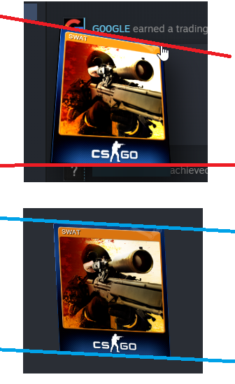
The difference between the two methods can be seen in the angle of the
lines I drew on. If you look at the blue lines (using the vanilla
rotate3d method), you'll notice that the two lines are parallel
to each other. However, the two red lines clearly have different gradients.
This left me feeling really confused, and I started to lose faith in the
project. As a last-ditch attempt to salvage it, I turned to the MDN
(Mozilla Developer Network) documentation for guidance. While reading
through the MDN documentation on the rotate3d() property, I noticed
that one of the examples used a CSS property called perspective. This piqued
my interest, as I suspected the issue might be related to the difference between
orthographic and perspective projection - a concept I'm familiar with from my
experience with Blender.
Adding Perspective
With this new weapon in my arsenal, I began experimenting with different
values to see how they would affect the rotation. I started with
perspective: 200px;, but nothing happened. Even when I tried
perspective: 1px;, the result was the same.
Determined to find a solution, I decided to integrate the perspective
directly into the transform property. One of the most satisfying
moments in programming is when an idea works perfectly on the first try, and
that's exactly what happened. I initially used
transform: perspective(200px) scale(1.5) rotate3d(1,1,0,25deg);, which almost poked my left eye out! After some fine-tuning, I found the
optimal value to be around 200px ±50px.
Here is a before and after showing the effect of adding the
perspective property:
Cursor interaction
The first step to getting the cursor to interact with the image was to trigger a function when the cursor overlaps an image. I found this fantastic article that served as a handy starting foundation for the rest of my code.
$(document).ready(function () {
  $("img").on("mousemove", function (e) {
    var offset = $(this).offset();
    var X = e.pageX - offset.left;
    var Y = e.pageY - offset.top;
    console.log(X, Y);
  });
});
The code above logs the X and Y coordinates of the cursor relative to the image. The next step involves some simple maths to calculate how to rotate the image.
The mathematics behind the code
Cursor positioning
The
rotate3d() documentation
by the MDN states that the rotate3d() function takes in four inputs:
(x, y, z, a). Since we're only going to be rotating the image
through the x and y dimensions, we can leave z as 0. For the angle (a), I decided to stick with 25deg for testing since it seems to be a similar angle to the one used by Steam's
trading cards. The next step is to try and calculate how much to rotate an image
by in accordance to the the position of the mouse.
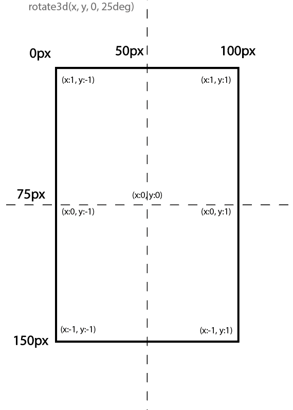
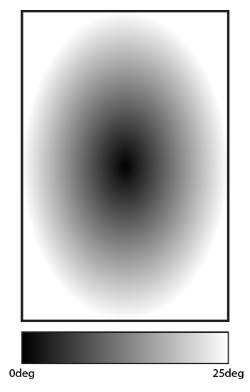
Now I need to convert the mouse location to the values shown in the diagram above. After some thinking, I realised that the best way of going about this would be to use a cosine function.
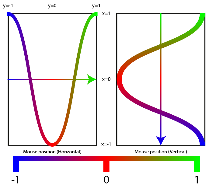
The diagram above shows the correlation between the x and
y values with a cosine function applied. It is a bit confusing
at first, but the idea is that values closer to the edges of the image should
have a higher rotation value, while values closer to the center should have
a lower rotation value.
Using the diagram, I came up with the following formulae to calculate the
rotation vectors for the x and y coordinates:
var xval = -Math.cos((mx / imx) * Math.PI);
var yval = Math.cos((my / imy) * Math.PI);
Here is a GIF showing the result of the cosine function method applied to the cursor interaction:
Lighting and scale
You may notice some jittering in the example above. I will get to that
later; for now, I want to focus on getting smaller and simpler details
such as the lighting effect and scaling figured out first. The lighting
will be very easy to implement since it's a simple filter
brightness() that changes with the cursor vertical positioning.
Here is the code snippet for calculating the luminosity:
var luminosity = 0.5 + (1 - my / imy); 0.5 is the minimum brightness (when the cursor is at the bottom
of the card). We add the minimum value to the fraction of the image the cursor
is from the bottom. Without the +0.5, the bottom of the card
would return 0 while the top of the card would return 1. For the scale, I initially planned on having using the css :hover selector, however, after some testing I found that it would interfere with
the cursor position readings and would cause even more jittering. So instead
of using static CSS, I implemented scaling using the JavaScript DOM so that
it would affect the whole
div instead of just the img. I also added the
box-shadow property in the DOM since the Steam trading cards have
a drop shadow. Here is the code for all of the DOM elements so far:
var transform = `perspective(200px) rotate3d(${yval}, ${xval}, 0, 25deg)`;

this.nextElementSibling.style.transform = transform;
this.style.boxShadow = "10px 10px 30px 0px rgba(0, 0, 0, 0.75)";
this.style.filter = `brightness(${luminosity})`;
this.parentElement.style.scale = "1.5";
Fixing the jittering
After some investigation, I found the cause of the jitter stems from the
scale(1.5) DOM CSS property I had included. What's happening is
that the card transitions too slowly so that by the time the scale returns back
to 1, the cursor is still overlapping which causes this
back-and-forth jittering. The method I used to fix this issue was to
create a new div to act as a trigger. I have coloured the trigger
in a translucent red so that you can see what it is doing.
With this new method, if the user places their mouse cursor over an area
that is within the card's "trigger" but not actually part of the card, it
won't jitter any more but will instead stay rotated. I forgot to mention
that I also switched the DOM around a little. I made the
transform, boxShadow and filter
part of the image element and made the scale part of the parent
card div.
Encountering a new issue
While working on fixing the jitter, I noticed a new bug where the rotation
would get stuck when the cursor approaches the center of the card. This is
because the rotation is a constant so even tiny changes are being related
to a rotation factor of 25deg. Once again, I have drawn a
diagram to showcase the method I am thinking of using to fix this bug.
The diagram above shows a map of cursor positions on the card relating to how the rotation will increase/decrease accordingly. To implement this method, I came up with the following formula:
var xval = -Math.cos((mx / imx) * Math.PI);
var yval = Math.cos((my / imy) * Math.PI);

var degval = ((Math.abs(xval) + Math.abs(yval)) / 2) * 25;
Final result
💡 Image quality heavily affected by GIF compression
JavaScript code
$(document).ready(function () {
  $(".trigger").on("mousemove", function (e) {
    var offset = $(this).offset();

    // Get mouse position relative to image
    var mx = e.pageX - offset.left;
    var my = e.pageY - offset.top;

    // Get image size
    var imx =
      parseInt(
        this.nextElementSibling.style.width.substring(
          0,
          this.nextElementSibling.style.width.length - 1
        )
      ) * 1.5;
    var imy =
      parseInt(
        this.nextElementSibling.style.height.substring(
          0,
          this.nextElementSibling.style.width.length - 1
        )
      ) * 1.5;

    // Calculate value 0 -> 1 for X and Y positions of mouse.
    var xval = -Math.cos((mx / imx) * Math.PI);
    var yval = Math.cos((my / imy) * Math.PI);

    // Calculate change in degrees with cursor position
    var degval = ((Math.abs(xval) + Math.abs(yval)) / 2) * 25;

    // Calculate luminsoity value for brightness depending on cursor position
    var luminosity = 0.5 + (1 - my / imy);

    // set DOM changes to style
    var transform = `perspective(200px) rotate3d(${yval}, ${xval}, 0, ${degval}deg)`;
    this.nextElementSibling.style.transform = transform;

    this.nextElementSibling.style.filter = `brightness(${luminosity})`;
    this.parentElement.style.scale = "1.5";
    this.nextElementSibling.style.boxShadow =
      "10px 10px 30px 0px rgba(0, 0, 0, 0.75)";
  });
});

// Function to reset all DOM changes
function mouseout(e) {
  e.style.transform = "";
  e.parentElement.style.scale = "1";
  e.nextElementSibling.style.filter = `brightness(1)`;
  e.nextElementSibling.style.boxShadow = "0px 0px 0px 0px rgba(0, 0, 0, 0)";
  e.nextElementSibling.style.transform = "none";
}
HTML code
<!DOCTYPE html>
<html>
<head>
<meta charset="utf-8" />
<link rel="stylesheet" type="text/css" href="styles.css" media="screen" />
<meta name="viewport" content="width=device-width, initial-scale=1" />
<script src="https://ajax.googleapis.com/ajax/libs/jquery/1.11.3/jquery.min.js"></script>
</head>
<body>
<div class="container">
<div id="card" style="transition: 0.5s;" class="trading-card">
<div
class="trigger"
style="width: 111px; height: 129px;"
onmouseout="mouseout(this);"
></div>
<img id="SWAT" src="card.png" style="width: 111px; height: 129px;" />
</div>
</div>
<script src="main.js" type="text/javascript"></script>
</body>
</html>CSS code
body {
  margin: 0;
  padding: 0;
  background-color: #2a2e35;
}

.container {
  position: absolute;
  left: 50%;
  top: 50%;
  transform: translate(-50%, -50%);
}

.trading-card:hover {
  cursor: pointer;
}

.trigger {
  position: absolute;
  z-index: 2;
}